


Lenovo unveiled a new brand identity said to be built around the belief that life rewards those who never stand still.
“Lenovo is always about making progress, moving forward,” said Michael Ngan, country GM, Lenovo Philippines. “Lenovo is very confident about its long-term success as a global technology leader. The changes that have been taking place in Lenovo have been multi-faceted–from being solely a PC company, to going into new business segments including tablets, smartphones and servers, and expanding the company’s global footprint with the acquisition of Motorola Mobility and System x. It’s time for our brand identity to reflect these amazing evolutions as we continue to build on our successful Protect and Attack strategy. We will protect our PC leadership while attacking our new engines – mobile, enterprise and ecosystem and cloud businesses – for growth.”
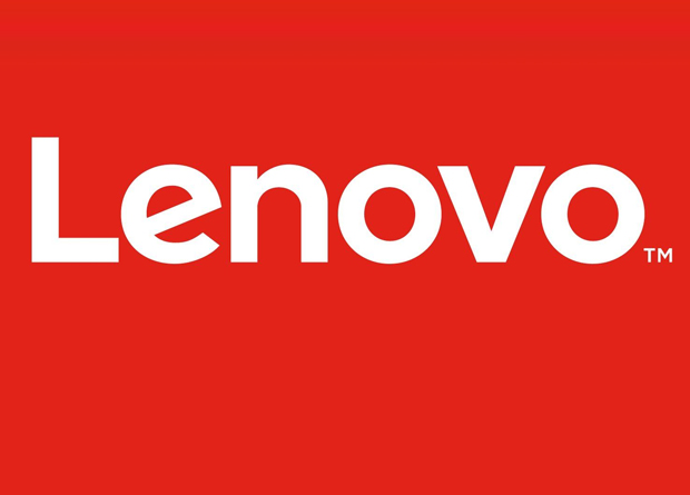
First debuted during Lenovo Tech World in Beijing, the new logo is the cornerstone of Lenovo’s new brand identity. It consists of the word Lenovo, a white wordmark within a containing shape, which now uses a typeface and a design that’s more contemporary, making it more readable so there are no pronunciation issues around the world.
The second element is the containing shape which allows it to be used as a tag like a fashion brand. It gives the logo room to breathe, as well as an opportunity for a playful use of the logo such as by filling the box with color and images, the better to bring it alive, and personalize it for specific products, people, places and events.
In addition to the primary logo, there is a collection of animated logos that feature images that cycle behind the Lenovo wordmark in the containing shape. This style is not intended for use as a static Lenovo logo, as it works best as an animation.
There is also a significant change in the color palette. Aside from to the previous Lenovo colors – Red, Black, and shades of Gray – there will be Oranges, Blues, Pinks and Greens, given that the company is now well embedded in the consumer space.
Together, all of these elements make the logo fun, energetic, highly relevant, completely dynamic, and evolves based on its environment. It is intended to make people recognize Lenovo wherever it may be, to clearly see what it stands for, and to communicate the message that Lenovo never stands still.